Yarn Color Combinations
These pretty yarn color combinations will have you eager to knit your next project!
So often, we find ourselves so bogged-down with the technical aspects of knitting, such as the right way to slip your stitches or the best stitch patterns to combat stockinette curling, that we forget one of the best parts about knitting: it truly is an art form! The artistry of knitting is what got many of us into the craft, so it's unfortunate when we find ourselves unable to enjoy the little things about it, such as the beauty of a delicate lace stitch, the coziness of a cable, or the feeling of satisfaction that comes from a pretty color combination.
Color theory is a pervasive lesson among many artistic crafts. Makeup artists expertly choose eyeshadow and lipstick colors based on the minute undertones of their client's skin and eye colors, painters pore over the exact drops of one oil paint necessary to mix into another color, and yes, even yarn dyers play with the ratios of certain natural and synthetic dyes in order to create lovely colorways for the very yarn we use to knit.
That said, the artistry isn't fully in the yarn dyers' hands! You still get to choose exactly which color combinations you would like for your colorwork projects, or even just your coordinating sets. Learn a little bit about color theory below, and then we'll get to some pretty and trendy color combinations for the upcoming new year for you to try out, too.
For more great projects like this, subscribe to our free email newsletter!
Table of Contents
Color Theory: Primary, Secondary, and Tertiary Colors
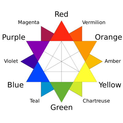
Below, we have a simple color wheel. Colors can be further divided in the color wheel by splitting them into primary, secondary, and tertiary colors.
The primary colors are red, yellow, and blue.
By mixing any two of these primary colors, you get the secondary colors of green, orange, and purple.
By mixing a primary color with a secondary color, you get the tertiary colors of violet (blue-purple), magenta (red-purple), amber (yellow-orange), vermilion (red-orange), teal (blue-green), and chartreuse (yellow-green). Depending on the ratio of one color over another, these colors can have an array of different names, such as cyan or cerulean for blue-green.
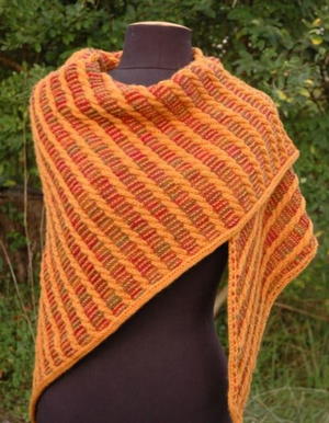
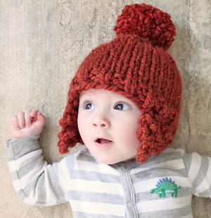
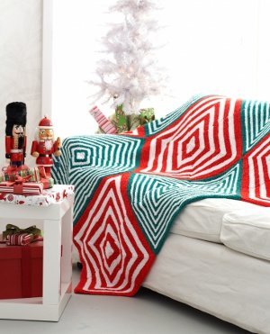
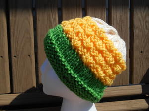
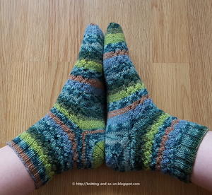
Take a look at some patterns using tertiary colors.
Color Theory: Complementary Colors
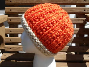
You'll notice that each one of the colors in the color wheel is arranged in a circle. Pick your favorite color, and then draw a line directly across to the color opposite of it on the color wheel. Those two colors are complementary colors: that means that they are exact opposites. You may think that this means they won't work well together, but quite the contrary. Complementary colors do just that: they complement each other. In fact, you'll often find sports teams sporting (excuse the pun) complementary colors as part of their logos: take, for instance, the yellow and purple of the Minnesota Vikings or the blue and orange of the Chicago Bears.
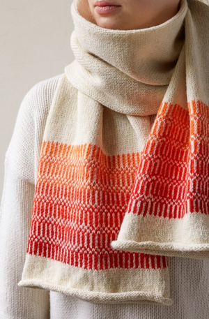
Often, the key to using complementary colors effectively is to let one color take the spotlight and to accentuate it with a small amount of the other color. Take a look at some knitting patterns below that use complementary colors in an effective manner.
Color Theory: Analogous Colors
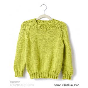
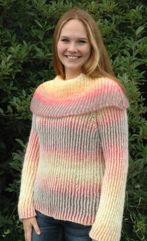
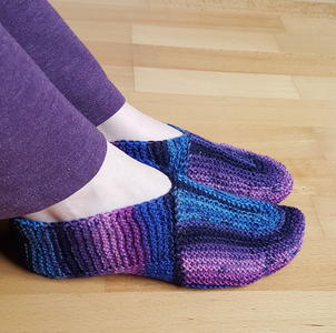
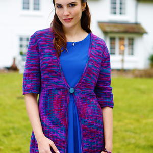
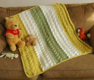
As opposed to complementary colors, analogous colors are two colors which are next to each other on the color wheel (or three, if you consider the tertiary colors), such as red and purple, or green, chartreuse, and yellow. These colors, since they have similar traits to each other, often blend very well in even or near-even amounts in a project. Below are some examples of analogous color schemes in knitting patterns.
Neutrals
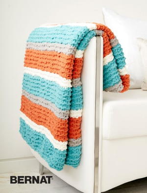
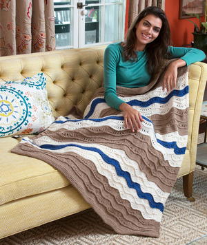
Neutral colors, such as white, black, gray, cream, taupe, you name it, can all be used to enhance colors. Like the colors you see on the color wheel, they can each even have undertones of certain colors; in fact, neutrals exist on sort of a spectrum with other colors, where when a color becomes more "muted," it grows closer to a neutral, and when a neutral becomes more "saturated," it begins to look more like a color wheel color. It's not only allowed but very much encouraged to utilize one or multiple neutrals in your knitting color schemes to help add some balance to the pattern and help the other colors pop. Check out some patterns below that utilize neutrals along with more saturated colors beautifully.
Complementary Purple and complementary desaturated neutral Ecru (Yellow) with neutral Taupe
Color Scheme Ideas
Mixing analogous colors with a dash of a complementary color is often a safe bet, but there are a ton of different color combinations to play around with to get something pleasing to the eye. I recommend looking toward nature for pleasant color combinations: consider, for instance, the small amount of bright red and orange among the deep blue of the ocean, or the pale gray-white of a cloud against a baby-blue sky. Here are a few color combinations I love:

Why does this work? The second and third colors are both shades of blue, and the fourth color is an analogous teal, all of which are offset by the neutral of black. This color scheme is rather edgy, so if you'd prefer a more understated or cheery color scheme, you could replace the black here with white, and for a more natural color scheme, it could be replaced with tan.

Why does this work? This brighter color scheme showcases a purplish-blue to the far left and its direct complementary color, a yellowish orange, in the third spot. The fourth color is somewhat analogous to the third, and the second color is somewhat analogous to the first while also being somewhat complementary to the fourth. Each color plays on one another very well in this color scheme, but be careful of creating a scheme with similar rules, because it can easily begin to look messy without a more grounding neutral color.

Why does this work? The second and third colors are both varying hues of green, but still instantly recognizable as green, which is complementary to the fourth color, a red. However, you don't think "Christmas" when you look at this color scheme, because the greens are closer to neutrals in their muted nature, which makes this color scheme a lot less in-your-face. Additionally, the first color being a dark, brown neutral really helps to give this color scheme a natural vibe, such as an evergreen forest in the winter, peppered with cranberries.

Why does this work? The first color is complementary to the fourth and analogous to the second. While orange and cyan may not normally make a pleasing color combination, the red, with which they're both related in a pleasing way, helps marry the two. A muted olive-toned eggshell neutral helps break up the bright, neon tones of colors 1, 2, and 4.
If you still need some help putting together a color combination for your knitting, I recommend Coolors or a similar color scheme creation app. It's perfect for knitters because, if you have a color of yarn you know you want to use, you can put the color in and lock it, so the app creates a color scheme around your chosen color. Play around and find the perfect colors for your next project!
Up Next:
Knitting Needle Sizes: Everything You Need to Know
With what colors will you be knitting your next project?
Read NextYarn Weight Categories 101

